Although details of their wedding plans are only slowly emerging, it looks as though the May 24 nuptials of Norway’s Princess Martha Louise and fiancé Ari Behn are going to be very different to her brother’s August 2001 ceremony. Most of the senior royals who attended Crown Prince Haakon’s wedding to Mette-Marit will not be present, for example.
Invitations have been sent out to all the royal houses of Europe, but – with the exception of Sweden and Denmark, whose royal families are directly related to Martha - they have gone to “young royals”. And plans for the wedding breakfast celebrations have taken into account the anticipated youthful exuberance of the guests. The dinner and ball will be held in a tent in the Stiftsgarden Gardens rather than in the ancient hall itself as there were fears that the building may not hold up to the dancing. Apparently the authorities were concerned that the chandeliers would start swinging.
No sedate colour schemes for the pair either. Martha and Ari have opted instead for the princess’ favourite shades of fuchsia and mint green for their wedding invitation. The same shades are also to be used for the banners with which Trondheim, the city where the ceremony is to take place, will be hung.
The funky hues have caused something of a headache for Norwegian television crews scheduled to cover the event, however. Odd Kaldefoss, project planner for state broadcasting company NRK, said the official colours can’t be used in TV studios because they are too distracting. The station, which was involved in the planning process for the Crown Prince’s wedding, has not been consulted about the upcoming nuptials.
Along with other elements in the design, the couple’s choice of monogram – a free-flowing “M” swooping into a heart before forming the letter “A” - has also come under fire. Award-winning Norwegian design professor Bruno Oldani described the overall concept as “terrible”. “The use of colours, typography and other elements is completely out of place,” he added. “It looks like a Russian mafia invitation to a wedding in Cannes.”
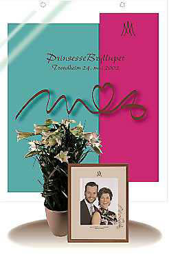
Photo: © Alphapress.com
The controversial mint green and fuchsia hues used for the wedding invites and street banners are particular favourites of the bride-to-be

Photo: © Alphapress.com
The couple, who will tie the knot in the Norwegian city of Trondheim on May 24, have planned their nuptials very much according to personal tastes